January 2, 2017
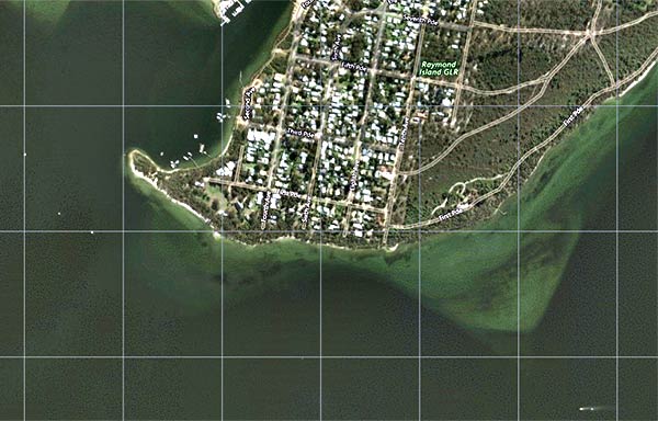
We’re in a lake area called Gippsland Lakes in Australia and the water is pretty skinny here. Complicating matters is our discovery that even the newest Navionics electronic chart information (downloaded yesterday on our iPad for yet another $54 payment) is wildly incorrect.
Our problems started yesterday when we got yet more local mis-information. It seems like this local believed that several of the areas where we wanted to anchor were too shallow for our 7′ draft. He also seemed to believe that an area where we happily anchored for two days was also too shallow for us. That was suspicious. It seems he was basing this on his use of Navionics SonarCharts. He bragged that because this was crowd-sourced, it was absolutely accurate and up to date.
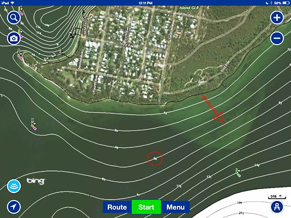
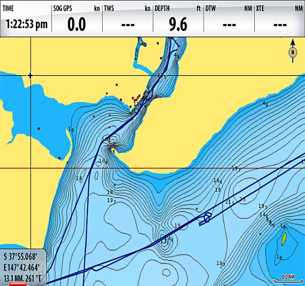
I spent the next three hours (and the aforementioned $54) trying to get these SonarCharts installed on our iPad. When I finally did, I was horrified. Even in Navionics own program, you can see how wildly inaccurate they are, at least in this area. This is apparent when you turn on the SonarCharts with a satellite image overlay, like the screenshot below.
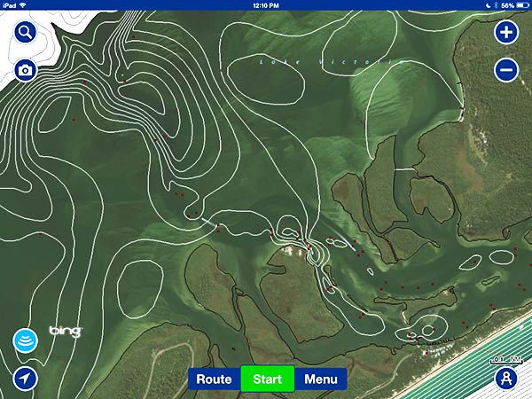
You can see that the depth contour lines have very little bearing on the shoals obvious from the satellite images. The other thing that I immediately noticed is that the channel we’d already entered to get to Paynesville was way too shallow for Legacy, at least according to Navionics.
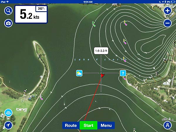
Above is a screenshot from our iPad as we left through this channel this morning. The area we passed through says 1.6 – 3.3 ft. deep. Legacy draws 7 feet. Neat trick!
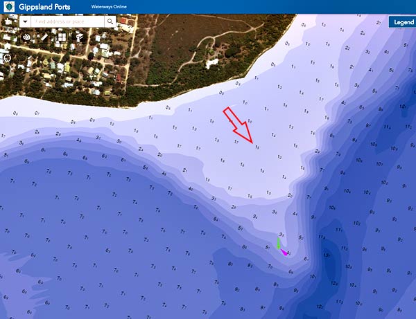
When researching this depth issue yesterday, I found that Gippsland Ports has a great online mapping program. (You can find it here.) Here is that same spot on a screen shot from the Gippsland Ports maps.
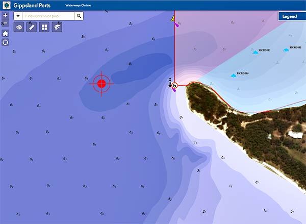
It shows the depth at that spot somewhere between 6 and 8 METERS! That’s a pretty big difference!
The problem with this kind of error is that if you believe the data, there are very few places you’ll visit here. There’s a more dangerous problem. Here’s what Navionics shows for an area south of Raymond Island.
Navionics shows that the depth at the red arrow is almost 7 feet. The visible shoal on the satellite image makes that data very suspect. Below, Gippsland Ports shows that same area as being only one and a half meters deep (and in complete agreement with the satellite image).
The large amount of detailed contour lines shown on the Navionics SonarCharts makes it appear that the underlying data is more accurate than it is. This is like weighing something on a scale that only reads to the nearest gram and representing the result as 3.434564 grams.
Not only does this kind of false-precision give the impression of greater accuracy than is present in the underlying data, but it turns out that all or most of the soundings in this area, regardless of how they are represented by Navionics, must be based on inaccurate or obsolete data. And it’s hard to believe this is the only area with this issue.
Here is a screenshot of the Navionics chart with SonarCharts turned off. There is only a single sounding in this entire area – 6.6 feet. I wonder where the rest of the “data” used for the depth contours came from?
I believe that the SonarChart data is supposed to be crowd-sourced; collected from the depth sounders of users as they traverse the world’s waterways. It’s hard to believe that any of the data represented on the SonarCharts for this area has been updated by users. Maybe there’s some way to tell when the data has been updated but if there is, I can’t find it. (It took me about a half an hour to figure out that you turn the SonarCharts on by clicking the little Navionics logo on the bottom, right of the screen. I couldn’t find it in the help file, nor online. I just found it by randomly clicking around.)
I understand that mapping the world’s oceans is a monumental task, but Navionics keeps charging me significant sums of money, while leading me to believe that their charts are accurate enough to be used safely (despite the disclaimer I am required to acknowledge each time I use their charts). Lots of this chart information is not a secret. In this case, Gippsland Ports makes the data freely available. I’m not sure what the official Australian charts look like in this area. I would just hope I’d get a better product for my many repeated payments to Navionics.
It’s been a while since I’ve felt like I could rely on Navionics charts. I first began to question them when we found an entire island missing in Tonga. In Fiji’s Northern Lau, we anchored on top of a mountain (at least according to Navionics). There have been many other examples where the charts were just wrong. Google to the rescue (at least partially).
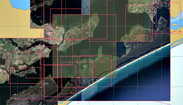
Above is a screenshot of just some of the nearly two dozen satellite images we’ve downloaded for this area alone. Below is a screenshot of a satellite chart displayed on openCPN of a couple of the problem areas I talked about above.
This chart (which is either from Bing, Nokia or Google, captured with ChartAid) shows dark water in the area we passed through and an obvious sandbar where Navionics shows safe water.
But here’s the thing I’ve realized about satellite images. If you can see an obstacle on the satellite image, it’s probably really there, but if you can’t see any obstacles, it doesn’t necessarily mean there aren’t any lurking.
Here are two examples.
- Just because the water looks dark and deep in the channel off the west point of Raymond Island in the satellite image above, it doesn’t mean it really is deep water. Shallow spots might just be hidden on the satellite image for whatever reason.
- I feel like I can count on obstacles that I can see in the satellite images. That sandbank off the southeast corner of Raymond Island (image above) really is too shallow for us to pass over.
On Navionics charts (and others as well, I’m sure), it doesn’t seem you can count on either what you can see really being there or what you can’t see really being clear of obstacles.
I’m not saying that all Navionics charts are bad. We’ve seen incredible accuracy in places like Sydney and Auckland. For that matter, all of NZ’s North Island seems pretty well charted. Australia’s Queensland and New South Wales is good too from what we’ve seem. But when we get just a little of the beaten path, where we really need accurate charts, they let us down.
“So, what can you do?”
In areas where there’s any doubt, we proceed slowly and with care. Despite all the satellite images, charts and other technology, Cyndi still spends a lot of time on the bow looking for obstacles, trying to spot them visually rather than feel.
If you have charts by a company other than Navionics, I’d sure love to know what kind of depth detail your charts show for this area. The “pass” I talked about above (2nd and 3rd photos) is at 37º 55.460 S, 147º 43.130 E. Let us know.
Rant over. -Rich
Wait, wait. Not quite over. Update, January 8, 2017
I updated the Navionics on my SD card. I did this largely to get the SonarCharts, thinking that while they’re wildly wrong here, they might be useful in Tasmania or other places we’re going. This also involved updating the firmware in our chartplotters. After all that, I never could find any way to turn on SonarCharts but I did find something called “Fish N Chips” in the menu. I turned that on and it looks a lot like the SonarCharts – except different!
Below is a screenshot from my chartplotter of the Fish N Chips chart for one of the areas I wrote about above.
And below is the SonarChart again from my iPad of the same area.

The Fish N Chips chart shows about 16 feet where in the spot that the SonarChart shows 1.6-3.3 feet. The Fisn N Chips chart is much closer to reality. It also shows the sandbank extending south from Raymond Island (that the SonarChart didn’t show).
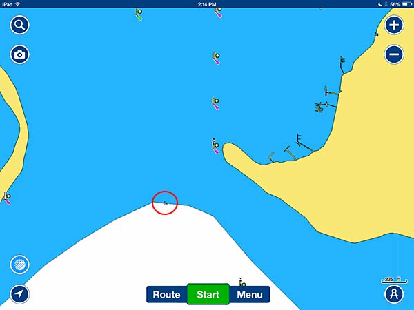
But all’s still not well. Below is a screenshot of the course we took this morning from our mooring.
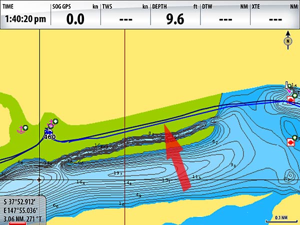
The chart shows that we motored our 7′ draft boat over a drying reef. Wrong!
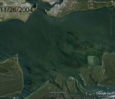
I heard the argument that maybe it isn’t possible to chart this area as “Sand Moves!” Not that much as it turns out. Below is an animated GIF from Google Earth showing images from 2004 to 2014. It turns out that the major bottom features haven’t changed much in ten years!
OK, if it can’t be right, I’d at least expect some consistency in the products from the same company. Which am I supposed to believe? None, I guess. And by representing incorrect depths with what looks like very precise contours, giving the impression of accuracy that’s just not there, I think this is a real danger to mariners.
OK, now the rant is over. -Rich